Android Pay App Makes the Switch to Google Pay, Gets Spicy New UI
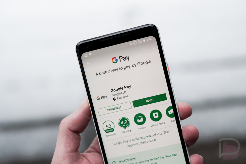
The next time you see an update to your Android Pay app, it will no longer be called Android Pay. Instead, Google will flip the switch over to the Google Pay branding it told us to expect back in January.
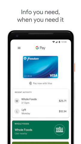
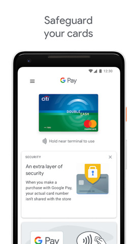
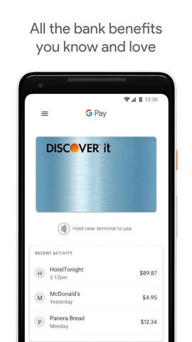
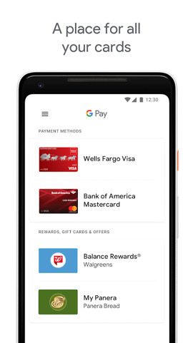
The change happened on Google Play over night and not only shows a change in name, but a refreshed UI as well. While I have yet to receive the update that changes the name, the new listing shows the branding and screenshots of what we can expect. Take a look.
This new, heavily white UI, is no longer filled from edge to edge with a stack of your cards. Instead, Google has made everything smaller, added more info to the front page (like recent activity), and tossed in a slideout menu to house settings. It's clean!
Be on the lookout for it!
Android Pay App Makes the Switch to Google Pay, Gets Spicy New UI is a post from: Droid Life
