Refining your website’s user experience in 3 steps
There are plenty of sites out there. Beyond producing great content, it's vital to make yours stand out. How? One way is to provide an exceptional user experience (UX).
Use tools to put yourself in your user's shoes, and then rectify anything that compromises their ability to move easily through your site. In turn, these optimizations can produce a positive impact on the performance of your ads.
1. Measure your site's performance
As a first step, assess your current website user experience to understand what developments are needed.
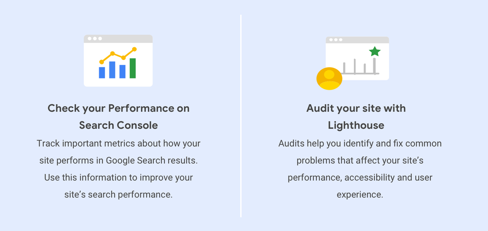
Track important metrics about how your site performs in Google Search results using Search Console. Find out how often your site appears, its average position, click-through rates and more.
The Performance report provides visibility into how your search traffic changes over time, where it's coming from and what search queries are most likely to show your site. See which pages have the highest (and lowest) click-through rate from Google Search.
Expose untapped performance opportunities and improve the quality of web pages through Lighthouse. With Lighthouse audits, you can identify and then fix common problems that affect your site's performance, accessibility and user experience.
Run a mobile-friendly test to see how easily a visitor can use your page on a mobile device. Just enter a page URL to find how you score. The majority of users coming to your site are likely to be using a mobile device, so if you haven't made your site mobile-friendly, you should.
With 53 percent of users abandoning mobile sites that take longer than three seconds to load, it pays to be fast. Check your mobile page speed and compare it against industry benchmarks.
2. Design for optimal user experience
Now that you know how your site measures up, it's time to put your analysis to use with UX strategies for improvements. There are three development frameworks you can consider using to create a smoother, faster experience for your users.
-
AMP (Accelerated Mobile Pages) is a framework of web components that lets you create a highly performing site that's consistently fast across all devices.
-
Responsive web design is about using HTML and CSS to automatically resize, shrink or enlarge a website to make it look good on all devices, including desktops, tablets and phones.
-
Progressive Web Apps provide an installable, app-like experience on desktop and mobile. Built and delivered directly via the web, these web apps are fast and reliable on any browser.

3. Keep mobile front of mind
Since the majority of users now access Google Search with a mobile device, the mobile version of your site's content is what informs indexing and ranking. If your site has separate desktop and mobile content, here's what you need to remember to optimize for mobile-first indexing.
-
Your mobile site should contain the same content as your desktop site.
-
Structured data should be present on both versions of your site.
-
Metadata should be present on both versions of the site.
When it comes to design, remember that users are impatient – so organise your site so that it's easy for people to find and do what they want. Focus your homepage and navigation on connecting users to the content they're looking for. Offer site search to ensure users can find what they need in a hurry. Understand your customer journeys and let users convert on their own terms. Provide a seamless, frictionless conversion experience through easy-to-use forms.
To learn more about what you can do to propel your website user experience from good to great, check out these mobile design best practices.
#Google #Android #Smartphones #OS #News @ndrdnws #ndrdnws #AndroidNews


