Google Images testing new mobile-style UI for the web
Google doesn't often revise its interface for image searches, though it did tweak the mobile UI a bit in October of last year. The web version is now getting a similar treatment, complete with a new look for the gallery and a new image viewer.
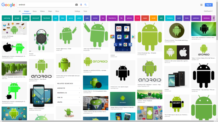
The current UI.
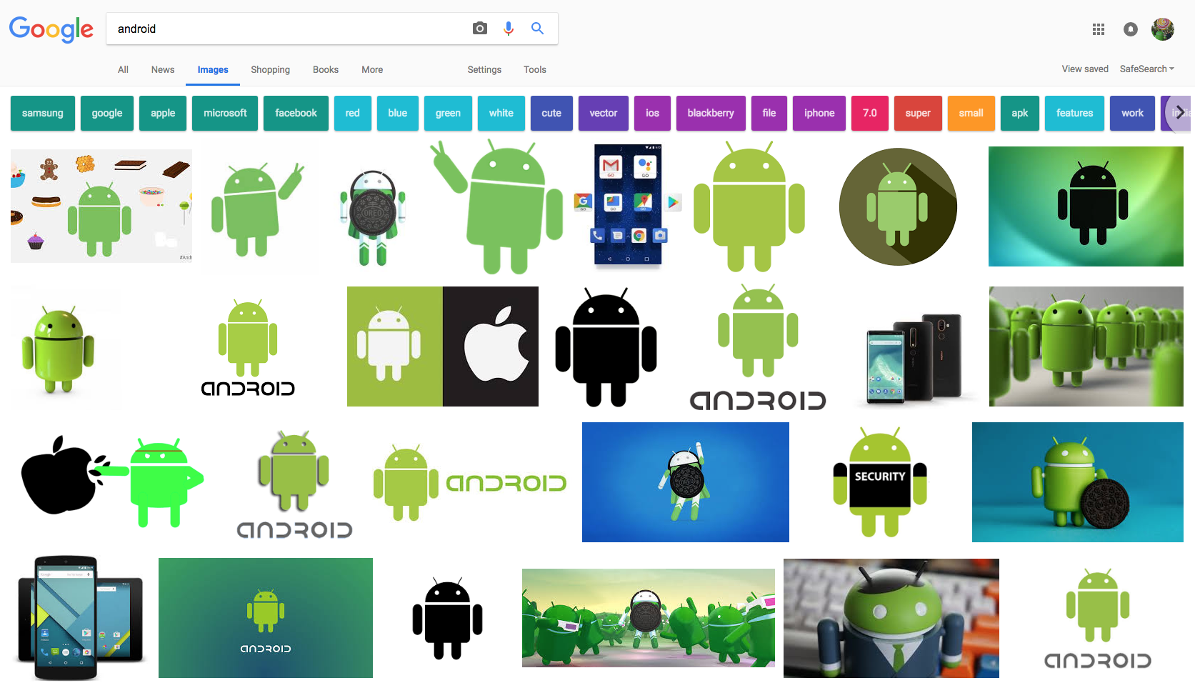
The new gallery look being tested is a bit hard to explain, but in a nutshell, it mirrors the mobile UI. That means that there are now a short caption and a URL source underneath each image preview. The images no longer conform to individual rows; instead, they're just kind of made to fit depending on their aspect ratios. Additionally, you'll also see a small "Related Searches" box among the image results giving a few searches Google thinks you might also be interested in.


left: The current UI. right: The UI test.
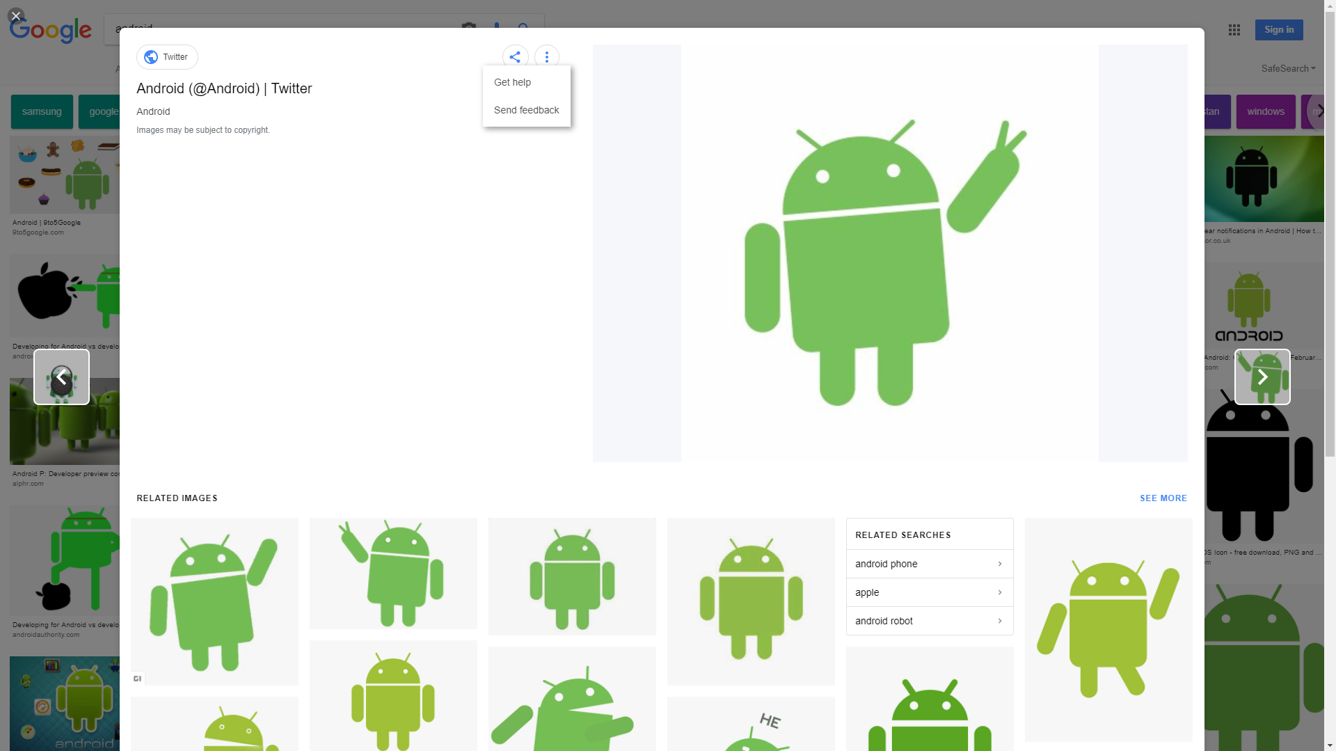
Similar changes can be seen in the image viewer. It looks like clicking an image will now create a popup of sorts with the image details on the left, the image itself on the right, and some rekated images below. The arrows on either side contain a small preview of the images you'll see by clicking on them. The two circular buttons ("share" and the three-dot menu) are also adopted from the mobile layout.
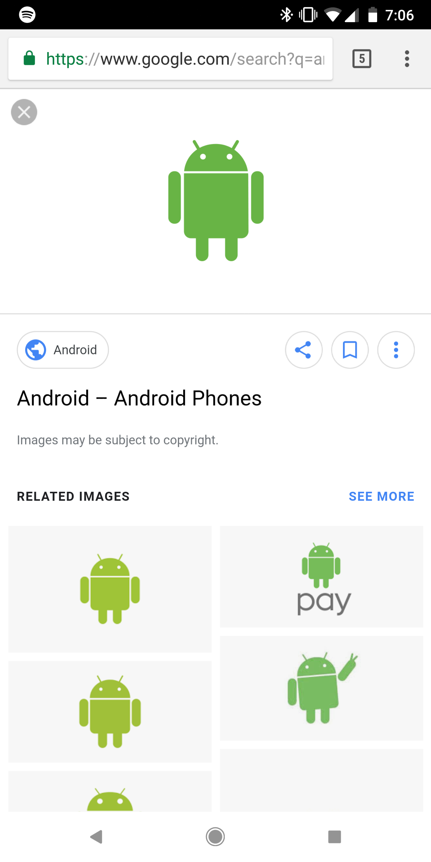
As has already been said countless times, it's all very reminiscent of what we're seeing on mobile. Here are some mobile screenshots if you don't believe us:


Our tipster only noticed this in incognito mode on his Windows 10 computer. I haven't been able to replicate the results on my iMac, but let us know in the comments if you're seeing this new test UI.
#Google #Android #Smartphones #OS #News @ndrdnws #ndrdnws #AndroidNews


