A new, fresher look for Google account settings is being tested
Google is currently testing a new design for its account page --- you know, the one buried in settings under the Google tab. In spite of the timing, it's not actually a feature of Android P DP3; it's just another one of Google's beloved server-side tests.


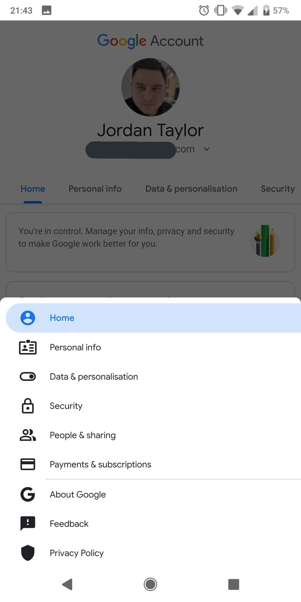
left: Current. middle, right: Test.
There isn't anything horribly wrong with the current UI, but it's just extremely bland and not that well laid-out. The test UI is a much better match for the rest of Android P's visuals, and it makes finding your way around a lot easier. Everything is more easily discoverable, and there are now four buttons on the bottom: Account, Search, Support, and Menu. There's also a horizontally-scrollable bar under your email that lets you swipe from section to section. Alternatively, you can press Menu and find the section there.
As for what devices are getting this test, it seems to be completely random. It's not based on your Google Play services version, not on your Google app version, and not even on your Android version. While some of us are unable to see the new view on DP2 or DP3, Stephen is seeing it on DP1. But we really shouldn't be surprised; this is Google at its best.
Overall, we're fans of this change. It's both more aesthetically-pleasing and more functional in general. Here's hoping that Google chooses to roll it out to everyone sooner than later.
#Google #Android #Smartphones #OS #News @ndrdnws #ndrdnws #AndroidNews


