Google Contacts 3.0 adds new Material Theme UI
The update is rolling out to the Play Store now.
Thanks to apps like Google News and Tasks, we've steadily been seeing Google's new design language — Material Theme — come to life. Material Theme is slowly replacing the Material Design standard that was introduced with Lolipop in 2014, and the latest app to adopt the upgraded aesthetic is Google Contacts.
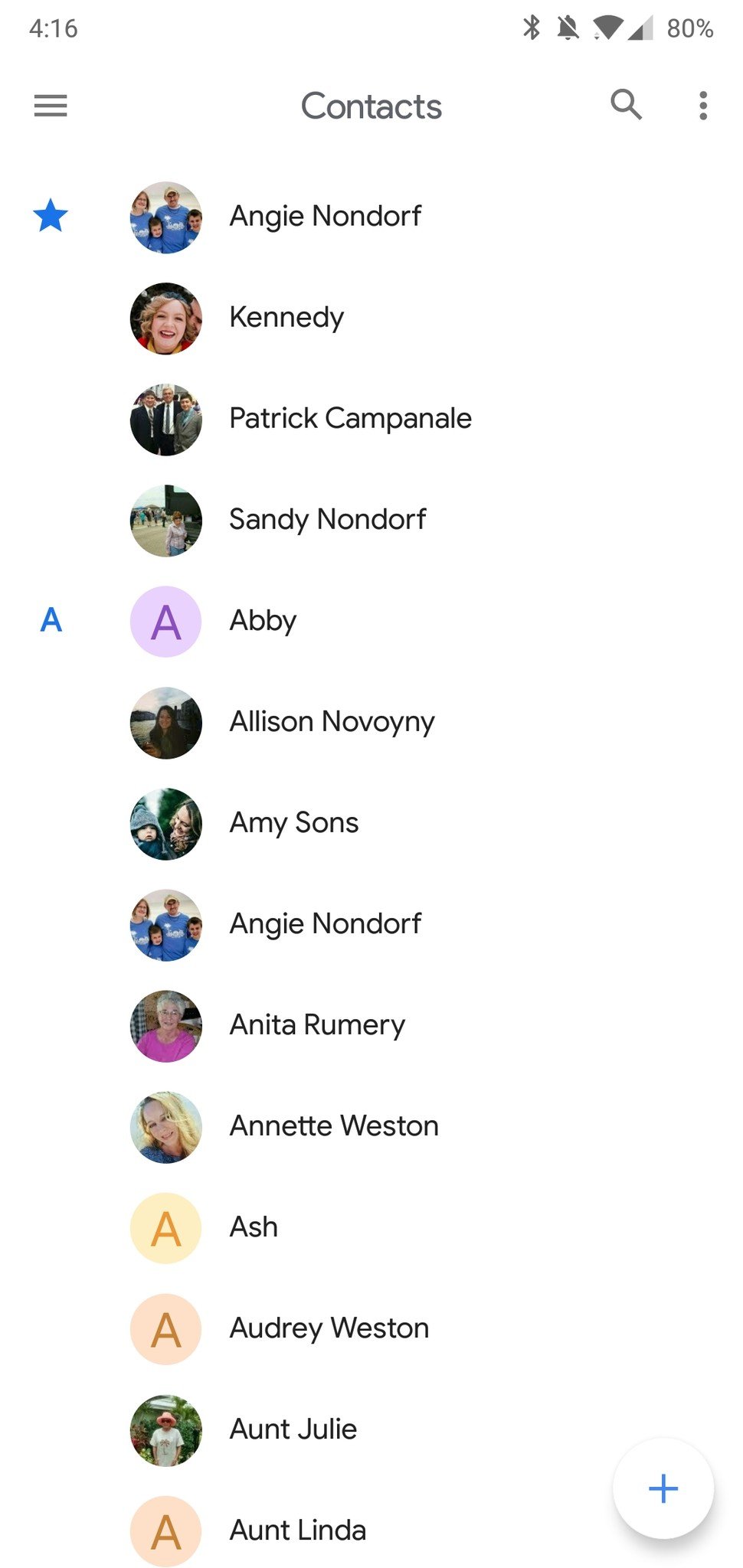
Google Contacts 3.0
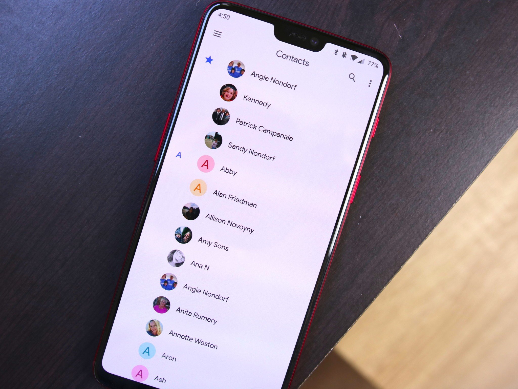
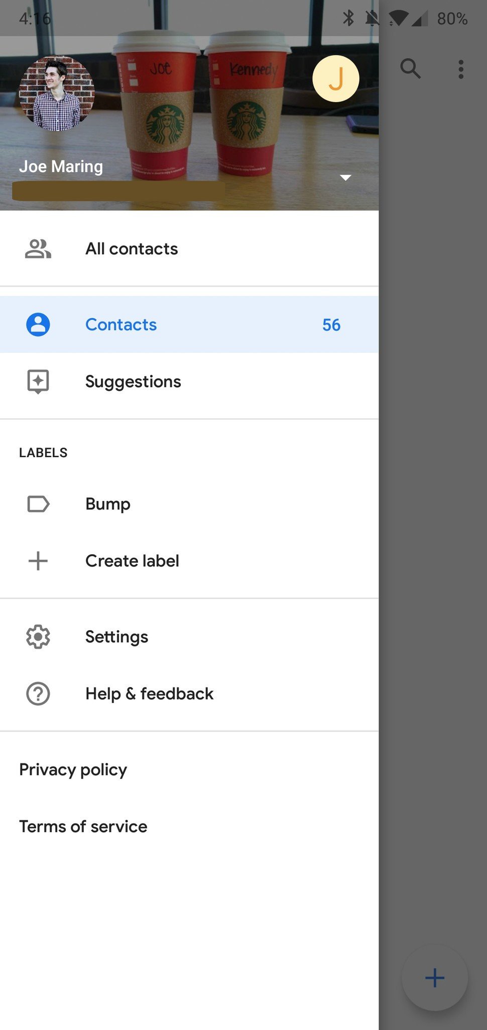
Version 3.0 of the Contacts app is rolling out to the Play Store now, and while all of the core functionality remains untouched, the user interface is now in-line with Google's new look. That's a nice way of saying that there's a lot more white elements.
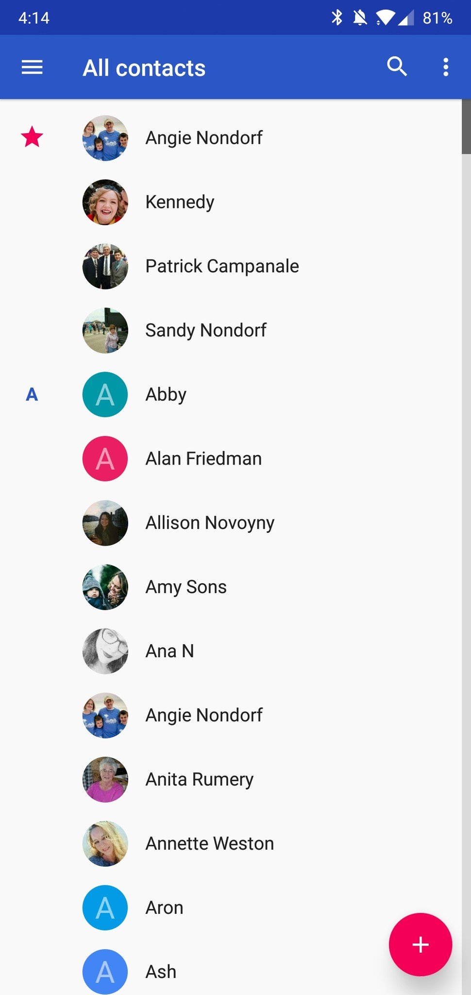
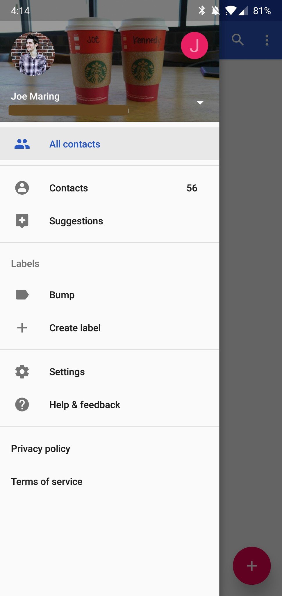
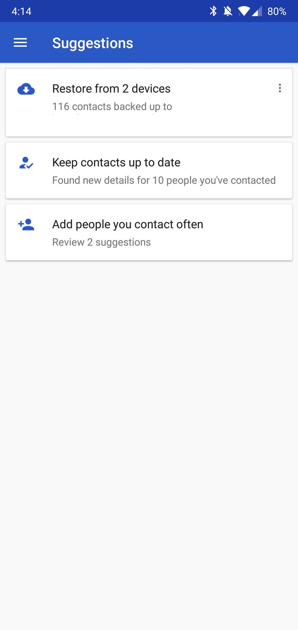
The deep blue header has been replaced with an all-white background and "Contacts" branding that's now centered, and the pink + circle is now white with a subtle blue accent. There's also a welcome touch of the excellent Google Sans font throughout the entire app.
Google Contacts 2.0
Although I loved the colors of the old Contacts app, I don't necessarily hate what we have in 3.0, either. Having a consistent look/feel across Google's apps is something that's been missing for quite some time, and while we're still in the early days of Material Theme, that consistency is already starting to take hold.
What do you think about Google Contacts 3.0? Sound off in the comments below!
#Google #Android #Smartphones #OS #News @ndrdnws #ndrdnws #AndroidNews

