Google debuts all-new Wear OS interface with Google Assistant feed
An all-new way to get to the core features of your smartwatch.
Wear OS hasn't been the most exciting platform the last few years, even back to when it was still called Android Wear. The interface has always focused on notifications and simplicity, but kind of lost its way when Google decided to make its watches feel more standalone and focus on apps. Now, Google's restoring some of the simplicity with an all-new interface for Wear OS.
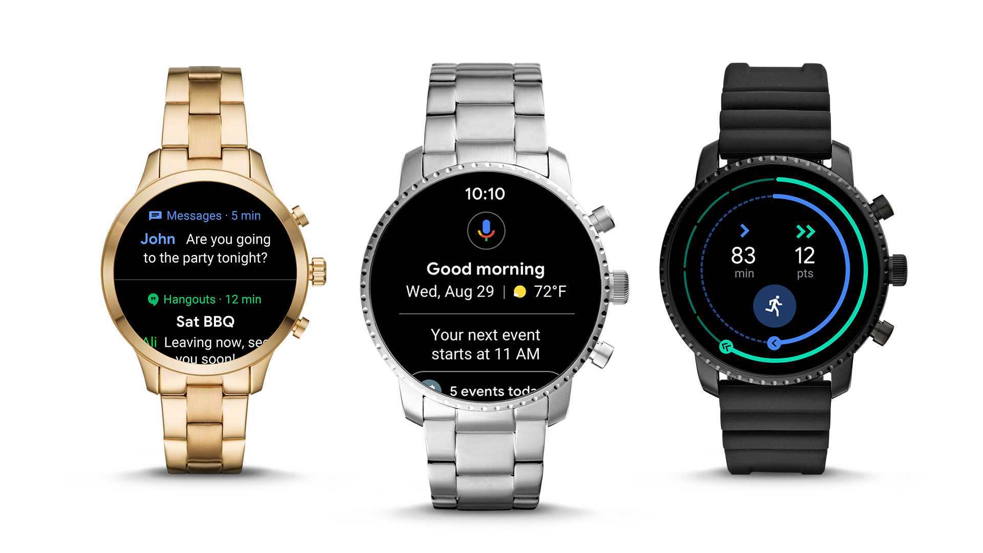
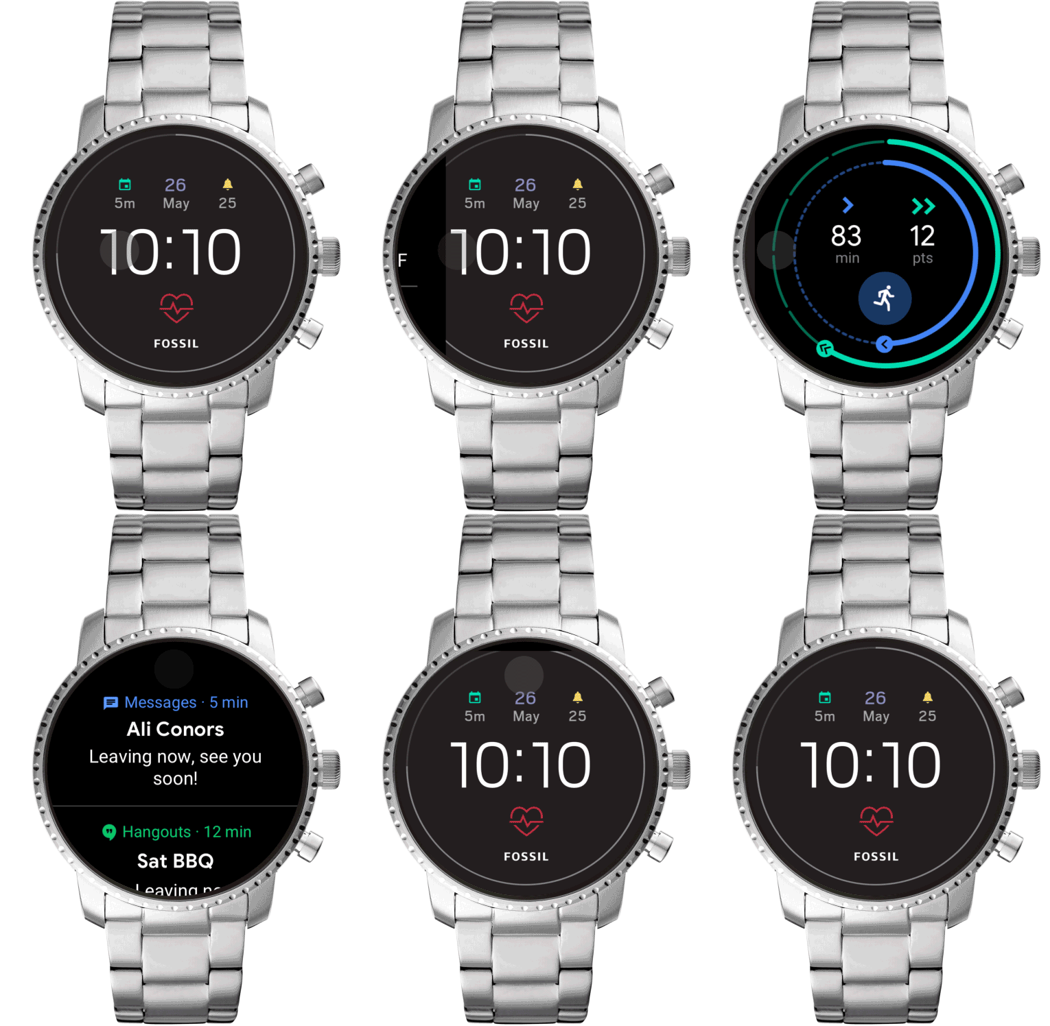
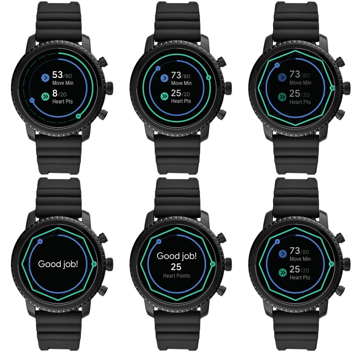
Here's the core of the experience: everything centers around the watch face, of course, and with a swipe up, down, left or right you head into a distinct (and currently non-customizable) area. Swipe down to reveal quick toggles for things like airplane mode, settings, do not disturb, volume and more. Swiping left reveals the just-announced all-new Google Fit interface, always ready to show you the latest progress on your health goals. As before, swipe up to see your notifications — each one takes up a majority of the screen, with actionable items available with a single tap. Unlike the current Wear OS interface, you can see parts of more than one notification at once.
Swiping right, you get perhaps the biggest change to the whole thing: a new Google Assistant interface. Rather than being a one-screen affair for talking to Assistant, this is a scrollable feed of upcoming information very similar to the old Google Feed or the latest Google Assistant interface on your phone. Scrolling through, you'll see information on the weather, upcoming appointments, travel times to points of interest, reservations and prompts to initiate a search with a single tap.
The previous idea that you'd be speaking to Google Assistant on your watch and getting audible responses didn't make a lot of sense, and this model is much more conducive to viewing quick bits of information all in one place. On such a small screen you want to limit the amount of time you're tapping around and waiting for things to load, so having that regularly refreshed and pushing information to the watch to be available at any time feels like a big improvement. It also seems like a good indication of the direction for Google Assistant on phones.
The new interface retains the option to scroll through a list of apps and launch specific apps, but it isn't a core interface paradigm — and considering what most people do with a small-screened smartwatch, that makes sense. With this initial release there isn't any customization of the swipe options, though — Assistant will be on the left, and Google Fit will always be on the right unless the smartwatch maker decides to replace it with their own fitness app. One question that remains is whether Google has cleaned up some of the odd bugs and interaction issues with various notifications on different screen sizes — too often on Wear OS you run into issues with buttons and interface areas being cut off because apps aren't being designed with a particular eye for detail on the platform.
This whole interface feels more complete and focuses on what matters in a smartwatch.
Google isn't announcing specific software update plans, but has said that the new Wear OS interface will start rolling out to existing smartwatches starting in September. Considering the hardware similarities between all of the current crop of Wear OS devices we can expect most modern devices to get the latest update, but that decision is ultimately up to the manufacturer.
This ultimately isn't a huge change, but feels like an important step forward in usability for Wear OS. Focusing on the core interactions with simple, well-defined swipes makes a whole lot more sense than being able to quickly change watch faces or access a scrolling list of apps. The lack of customizability feels odd for a Google product, but could be changed in subsequent releases. With this new software out in the world, now it's time to get some fresh Wear OS hardware based on the forthcoming Qualcomm wearable processor to make this feel like a complete generational jump.
#Google #Android #Smartphones #OS #News @ndrdnws #ndrdnws #AndroidNews


