2018 Material Design Award winners announced, all featuring unique Material Themes
Back in August, Google opened up nominations for the 2018 Material Design Awards. Three months later, the four winners have been unveiled with all leveraging the new Material Theming platform announced at Google I/O.
Now in its fourth year, these awards from Google Design "honor the product teams that bring Material to life."
These best-in-class examples showcase the flexibility of our adaptable design system by making it uniquely their own.
Open to self-nominations and then deliberated by Googlers, there are four categories. The iconic statues will be awarded tomorrow in a ceremony at SPAN — Google's design conference — in Helsinki this year.
- Expression: Brand identity brought to life through the engaging and harmonious use of color, imagery, typography, and motion.
- Innovation: Demonstrated ability to build upon and extend the Material Design system in inspiring new directions.
- Experience: Creative and effective deployment of interaction, navigation, and content in service of an impactful user experience.
- Adaptation: Cross-platform design that delivers a consistent experience, with native features and functionality optimized for each device.

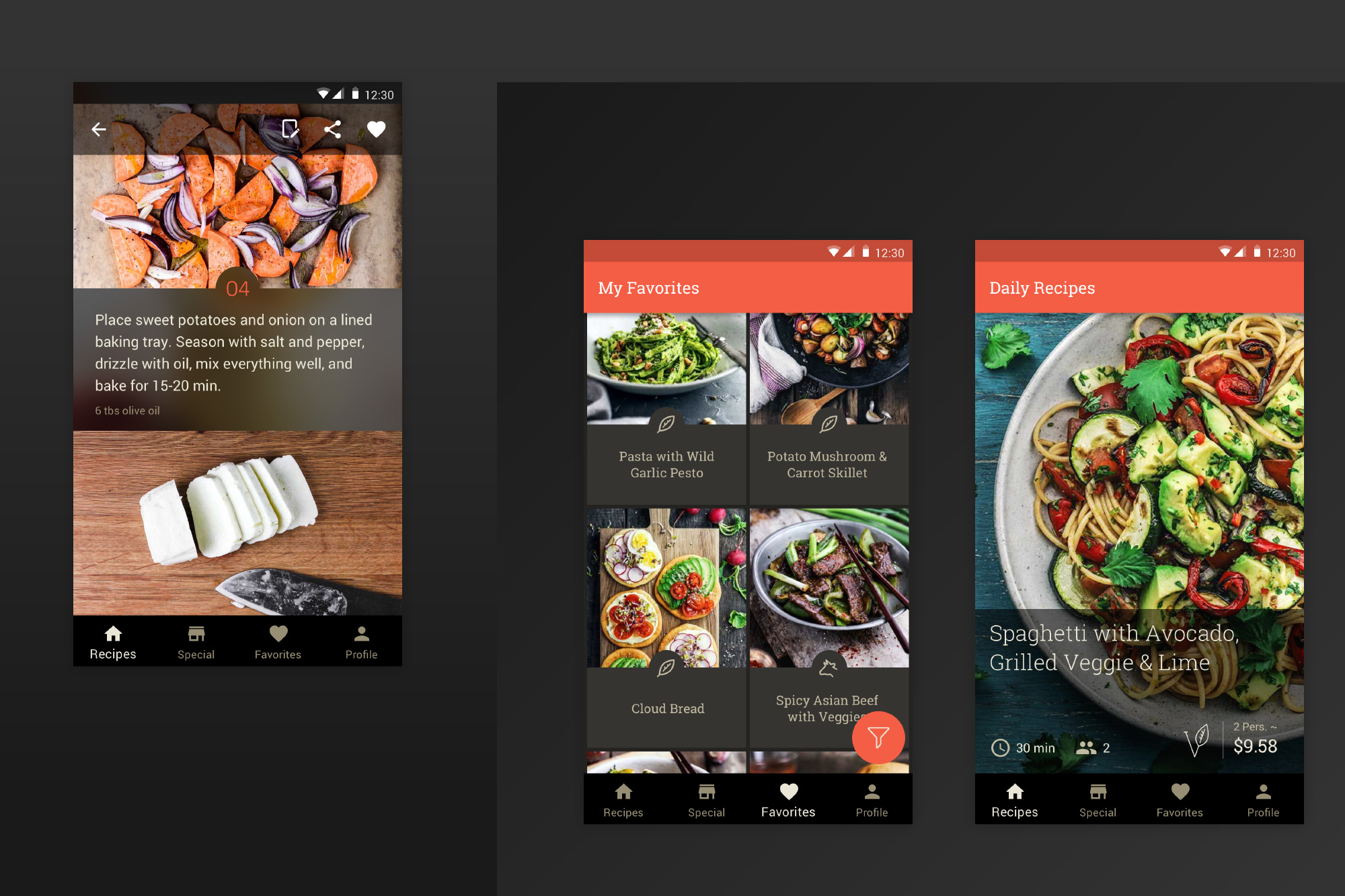
KptnCook's intimidation-free approach to cooking extends through the app's engaging, hassle-free design. Step-by-step instructions with images of ingredients and techniques lead users through the cooking process; these detail pages feature a transparent top app bar that references similar touches within the app. The Favorites view features a scannable image list of saved recipes, with branded iconography and type, plus a custom shape for text protection. All these details work with the app's immersive, full-screen imagery to showcase beautifully executed meals.
Innovation: Lyft

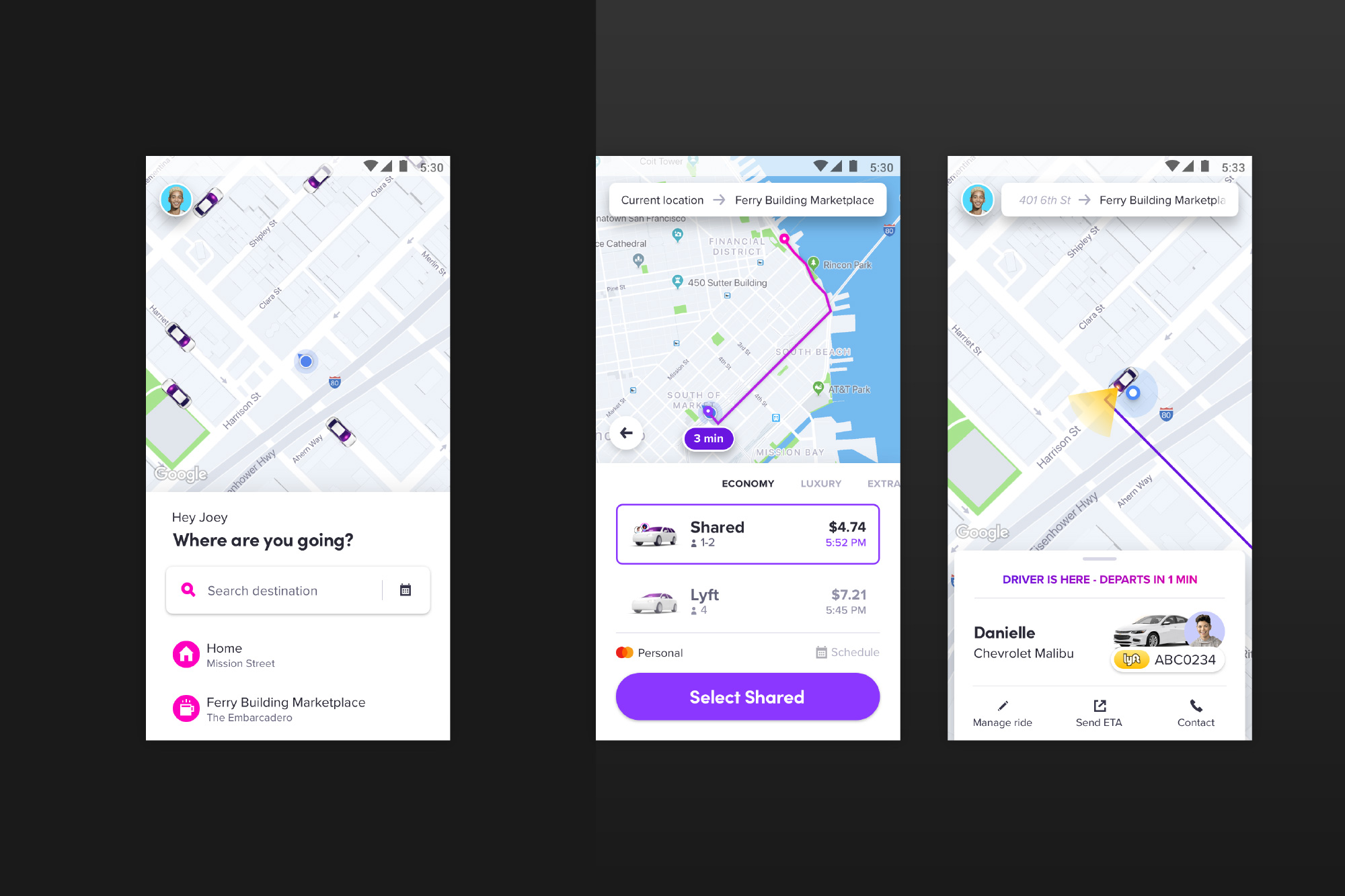
Lyft recently revamped its app, rethinking fundamental aspects of the backend UX while also adopting and adapting Material Components in impressive and unexpected ways. Bottom sheets and an extended Floating Action Button (FAB) optimize available screen space throughout, while custom color system algorithms ensure accessibility and legibility of their iconic neon-bright hues. Using their own take on Material, Lyft has seamlessly realized a singular brand expression.

Learning how to slow down and de-stress requires an equally tranquil interface; from first tap, Simple Habit Meditation opens up with an easy onboarding experience—which employs color-coded, selectable image cards to support the calming, purposeful navigation. It uses a dark theme effectively, with cool implementation of cards and bottom navigation, branded typography, and subtle motion cues across mobile devices and tablets.

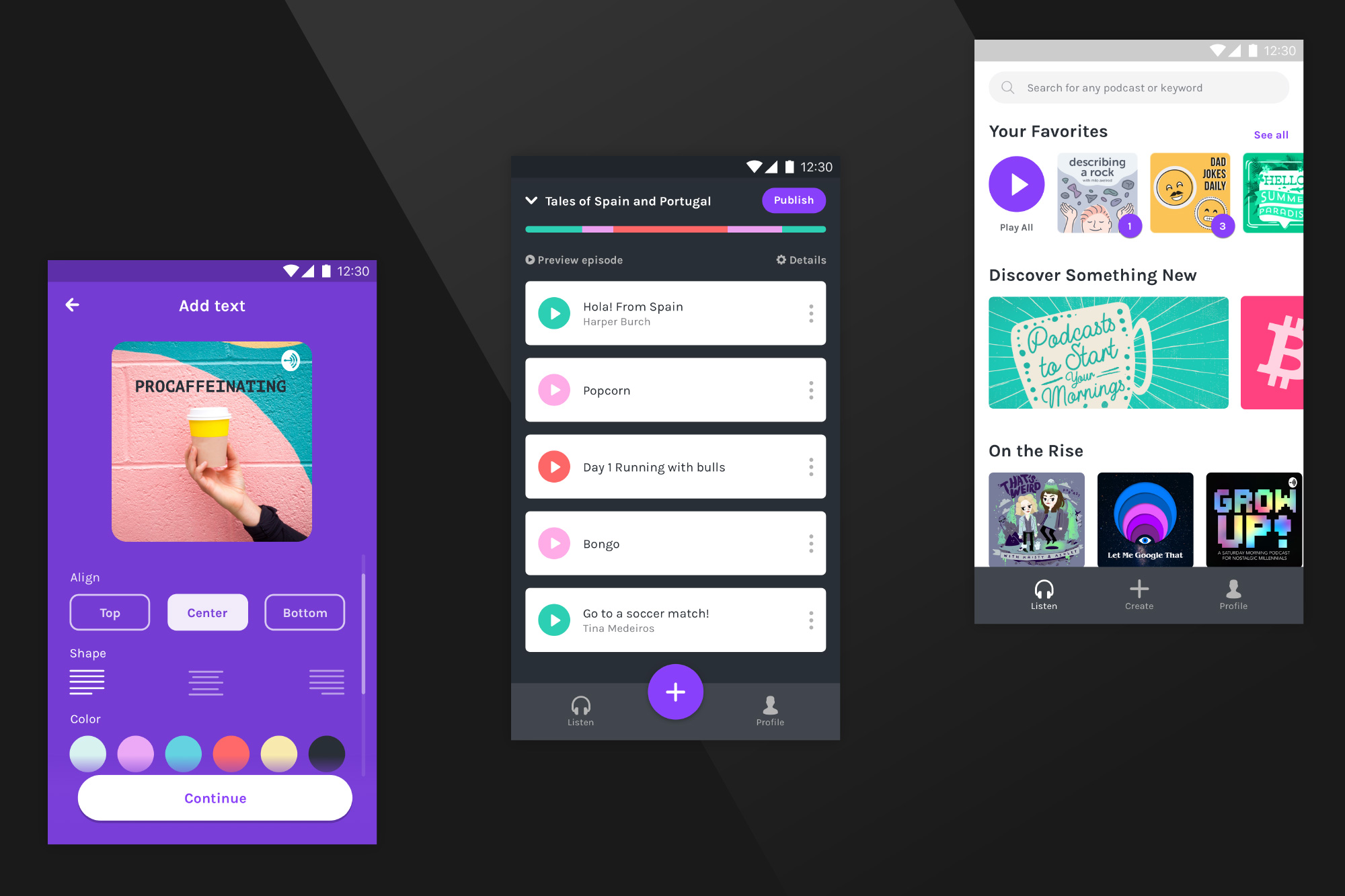
Anchor's DIY podcast tool is impressively buttoned-up, with a seamless flow across platforms and devices. Android and iOS users can record from their phones and find the audio automatically uploaded to the web app. Choice chips clearly delineate and display options for the alignment selection in edit mode, where an extended FAB is anchored to the bottom to allow the action to remain persistent. Nice animations complement this solid cross-functional solution for aspiring broadcasters.
Previous Material Design Awards:
Check out 9to5Google on YouTube for more news:
VIDEO
#Google #Android #Smartphones #OS #News @ndrdnws #ndrdnws #AndroidNews
