OnePlus has nearly solved Android's navigation future
OnePlus has a new feature that improves navigation on Android phones by copying the iPhone X.
OnePlus is in a weird place right now. It's dealing with accusations of privacy violations, and has just made public an enormous credit card breach that affected at least 40,000 paying customers. There have been public calls to stop buying their phones.
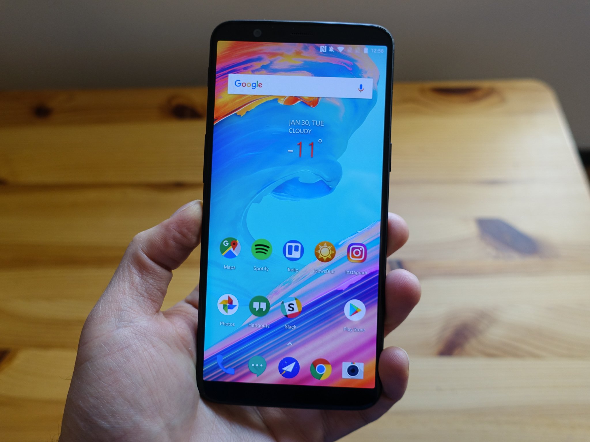
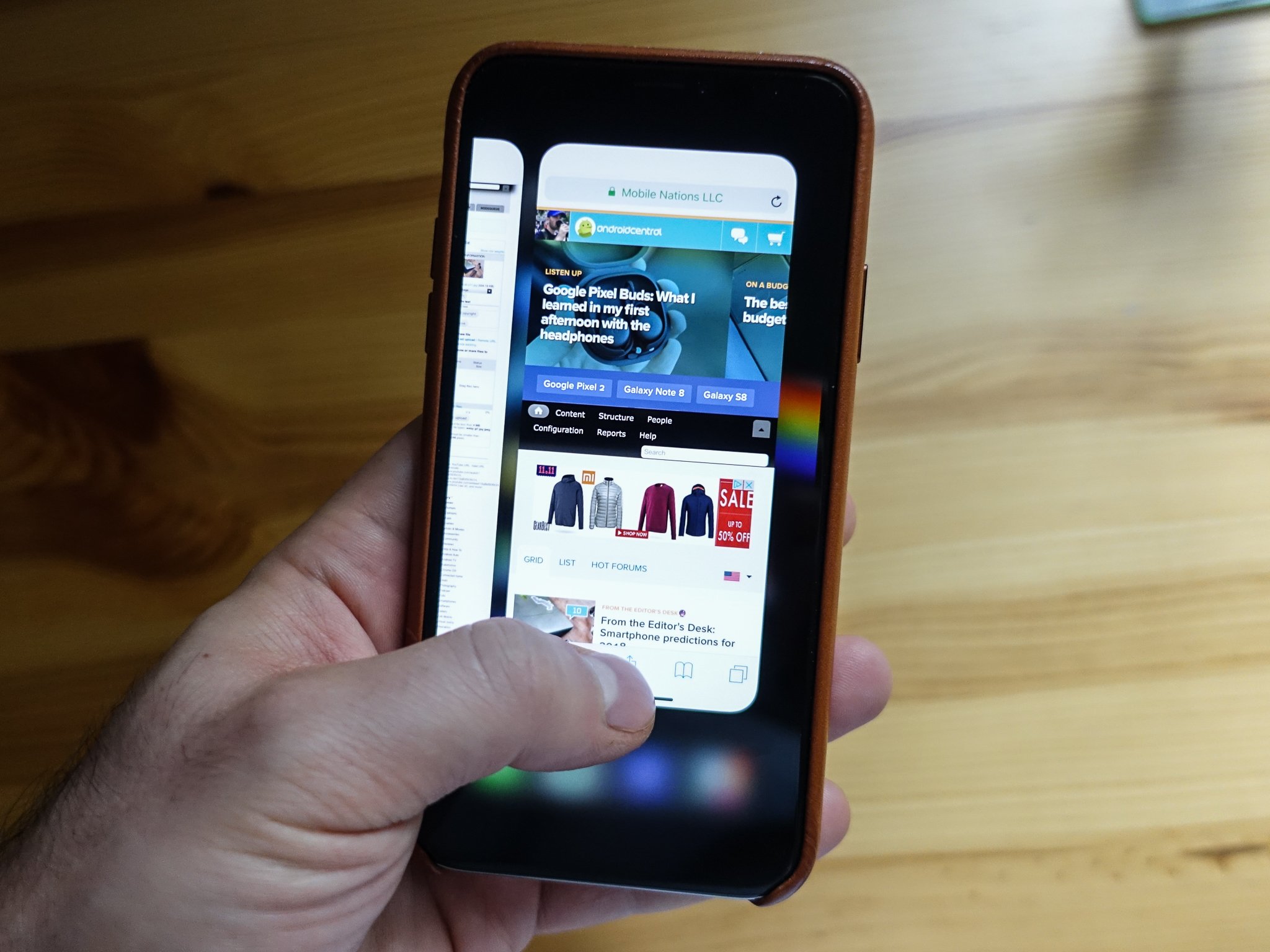
But the company continues to operate, releasing new colors of its flagship OnePlus 5T and working towards stable versions of Android Oreo for its 2017 lineup. In its most recent release, Open Beta 3, for the OnePlus 5 and 5T, the company unveiled a new way to navigate the operating system, and in my short time with it I'm proclaiming it the best alternative so far to on-screen navigation buttons. It's a gesture system that to some extent mimics the iPhone X's swipe combinations, adding some Google-specific nuances to overcome differences between Android and iOS.
Here's how it works: you enable a new setting that hides the traditional Android navigation bar of (from left to right) Back, Home, and Multitasking buttons. Android has relied on some combination of these buttons, in virtual or capacitive form, since its inception. But with the proliferation of taller, more capacious displays, manufacturers have been trying to find a way to use all that valuable real estate.
Once the setting is enabled, the on-screen buttons disappear and a brief tutorial guides you through the three new gestures: swipe up from the middle part of the bottom of the display to go home; swipe up from either the left or right parts of the bottom to go back; and swipe up from the middle and hold to activate the multitasking screen.
Swiping up from the bottom of the OnePlus 5T returns home — just like the iPhone X.
At first glance, this combination copies almost entirely the iPhone X's user experience of swipes and gestures, though the OnePlus solution takes into account Android's reliance on an explicit back gesture, as opposed to a swipe in from the left side of the display, to return to the previous screen.
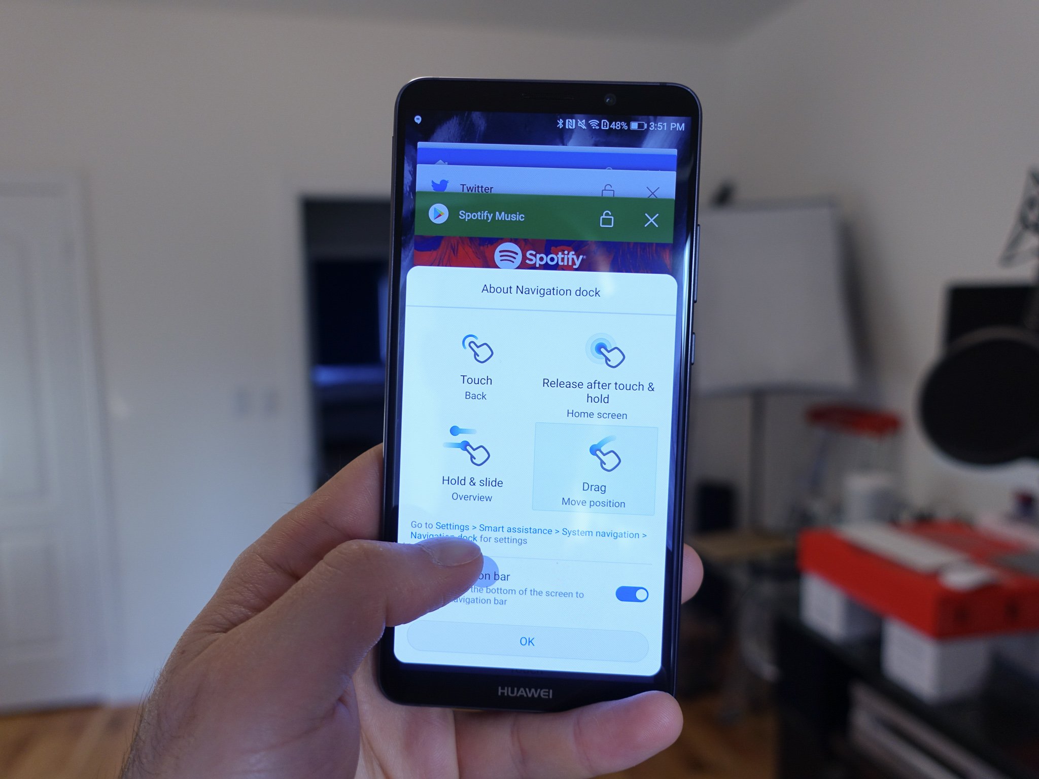
But even in this early stage, the OnePlus solution feels natural in a way that other gesture-based navigation systems from Huawei and Motorola, for example, do not. I have yet to return to the traditional on-screen buttons out of frustration, nor have I experienced any false positives. The gesture animations themselves are a little clumsy, and the haptic feedback after each one is a bit too heavy-handed, but these things can be adjusted over time.
This feels like the first time I can use gestures to navigate Android without hating my phone.
Moving to gestures also eliminates the shortcuts that both Google and OnePlus have added to the on-screen buttons over time. For instance, it's been possible since Nougat to double tap the multitasking key to quickly return to the previously open app, or to hold that button down for a moment to activate Multi-Window mode. And OnePlus has an extensive collection of additional programmable shortcuts that rely on the on-screen or capacitive buttons. With gestures comes simplicity, and those macros disappear.
The feature also doesn't fix the occasional clumsiness of Android's back button. For years, app developers have been forced to decide whether the back button returns to the previous screen, as Google intended, or to a particular place in the app. This becomes even more complicated when an application launches within an existing one, creating a matryoshka doll of windows that requires numerous presses of the back button. Here, OnePlus is merely recreating the existing behavior using gestures.
It's long been rumored that, given the blank slate nature of near bezel-less displays these days, future Android versions would do away with on-screen buttons, shifting to a combination of swipes and gestures to move around the operating system. Such a fundamental change would have to come from Google itself which, with its annual software cycle, would then trickle down to the companies that make the phones.
Of course, that isn't how Android works; everyone from Samsung to Huawei to HTC has, over the years, adapted their navigation paradigms to suit whatever changes they were making to Android itself, but more recently the trend has largely been to follow whatever Google is doing. (That it took until 2017 for Samsung to switch to on-screen buttons shows how opinionated companies are about navigation.)
It's unlikely that OnePlus's gesture replacement, which currently only exists as an opt-in feature within beta software, will become the norm on OnePlus phones — at least for the foreseeable future. But this small step proves that, within Android, it's possible.
The solution also makes dynamic something that's traditionally been relatively static on Android phones: the placement of the oft-used back button. Given that the gesture is available on either side of the phone, it biases neither left- nor right-handed users. With screens getting larger and one-handed usage a consideration, it's a big deal for me, as a righty, not having to contort my thumb to the other side of the screen hundreds of times a day.
Who knows — it may even save me a trip to the doctor one day.


