HTC U12+ review: They fixed the buttons! [Updated]
With the digital buttons fixed in software, it's time to reconsider HTC's 2018 flagship.
When we first reviewed HTC's latest handset, its digital buttons were kind of a mess. But with a software fix now rolling out, the U12+ is well worth a second look.
HTC U12+
Price: $799
Bottom line: HTC's new high-end offering is speedy, with impressive glass-backed designs and very capable cameras -- but beware of the digital buttons, which will be a turn-off for some.
Pros:
- Speedy performance and minimal software bloat
- Stunning photo quality across the board
- Beautiful colored glass back panels
Cons:
- Digital buttons can be finnicky
- Dated HTC Sense UI design
HTC U12+ Prelude
When we first reviewed the HTC U12+ back in June, it was kind of a mess. That was almost exclusively the fault of the digital buttons: the pressure sensitive nubs that replaced the power and volume keys. More generally, the Edge Sense 2 features, which includes all the phone's pressure-sensitive capabilities, were equally wonky out of the box. Problems included ghost presses, wildly varying sensitivity, in some cases leading to the phone hard resetting itself due to ghost input.
But now, thankfully, for there's new firmware rolling out to address these issues. With that in mind, as promised back in June, this phone deserves a second look. Because otherwise, the U12+ has plenty of redeeming factors -- not least of which is an amazing camera that matches the Pixel 2, and challenges the Huawei P20 Pro.
So let's come at the U12+ fresh, with the latest firmware and an open mind.
About this review
We originally published this review after two weeks with the HTC U12+. I (Alex Dobie) used a European U12+ in the UK on EE, and in Taipei, Taiwan on Chunghwa Telecom. Shortly after picking up my first U12+ unit, I noticed multiple issues with the phone's new, all-digital volume and power keys, as well as the pressure-sensitive Edge Sense feature. HTC replaced the phone with a different unit, which performed better than the first, but exhibited the same problems after around 24 hours. During the original review period, my device was running software version 1.15.401.4, based on Android 8.0 Oreo, with the March 1, 2018 Android security patch.
On July 27, the device got an update to 1.21.401.3, with fixes for the digital buttons and improvements to battery life. We're updating this review on July 31 to reflect these changes.
HTC U12+ Full Review
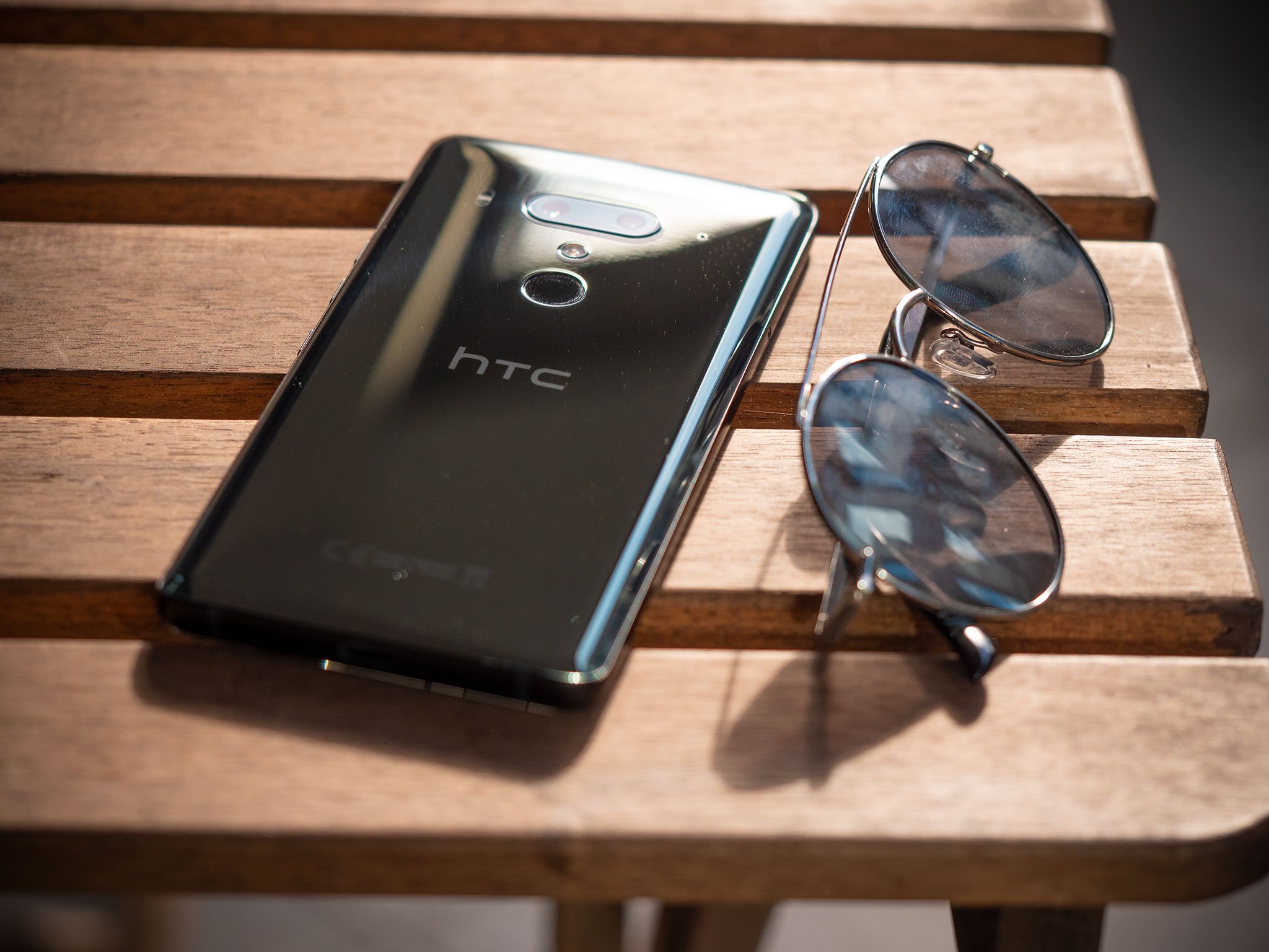
If you're familiar with the U11+, the under-appreciated extra-large cousin of the U11 that launched in late 2017, then the design of the U12+ will be very familiar.
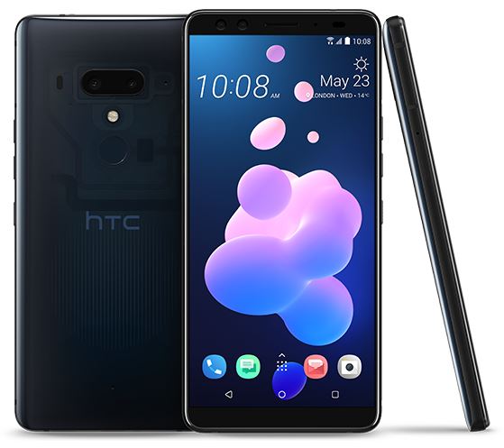
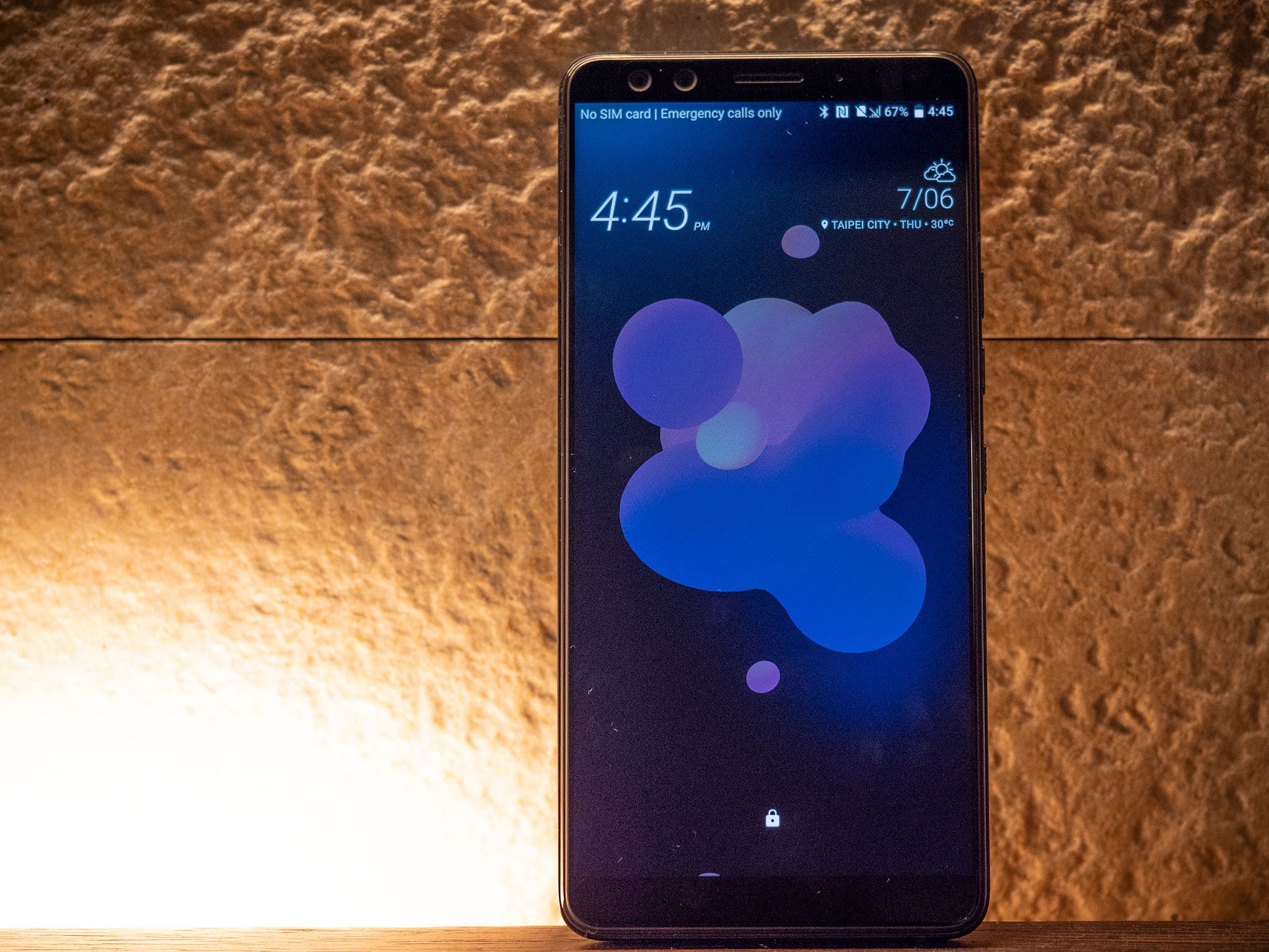
For everyone else, this is a pretty standard 18:9 Android slab from the front, with a few pleasing design cues to set it apart. There's no display notch, for what that's worth. Instead, the U12+ sports a slightly asymmetrical forehead and chin. And the surface of the display is raised up from the metal frame by a near right-angle curve of the glass itself. At first, I mistook this for a plastic rim, but nope: it's curved, angled glass going straight into metal, which is an impressive manufacturing feat.
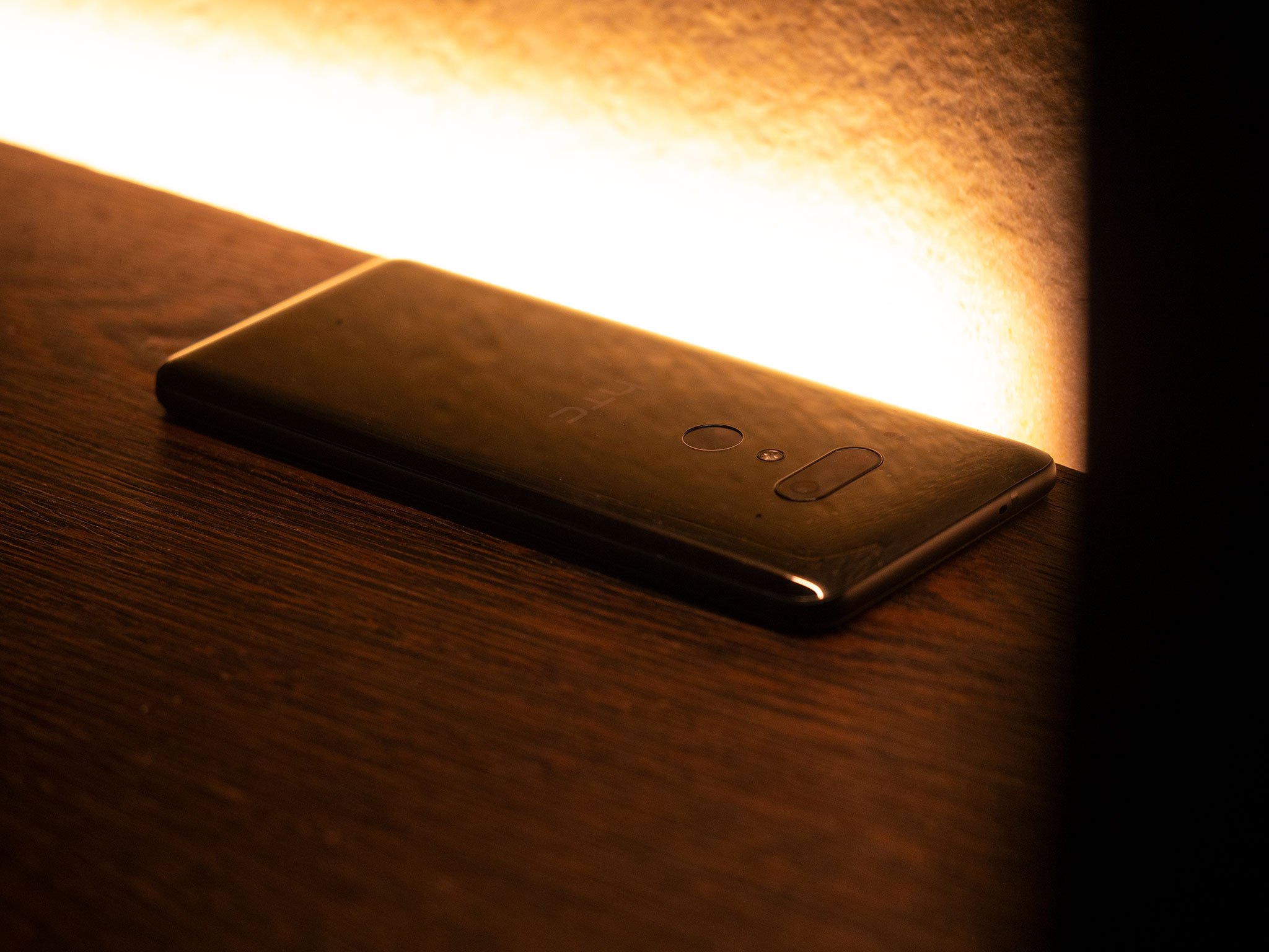
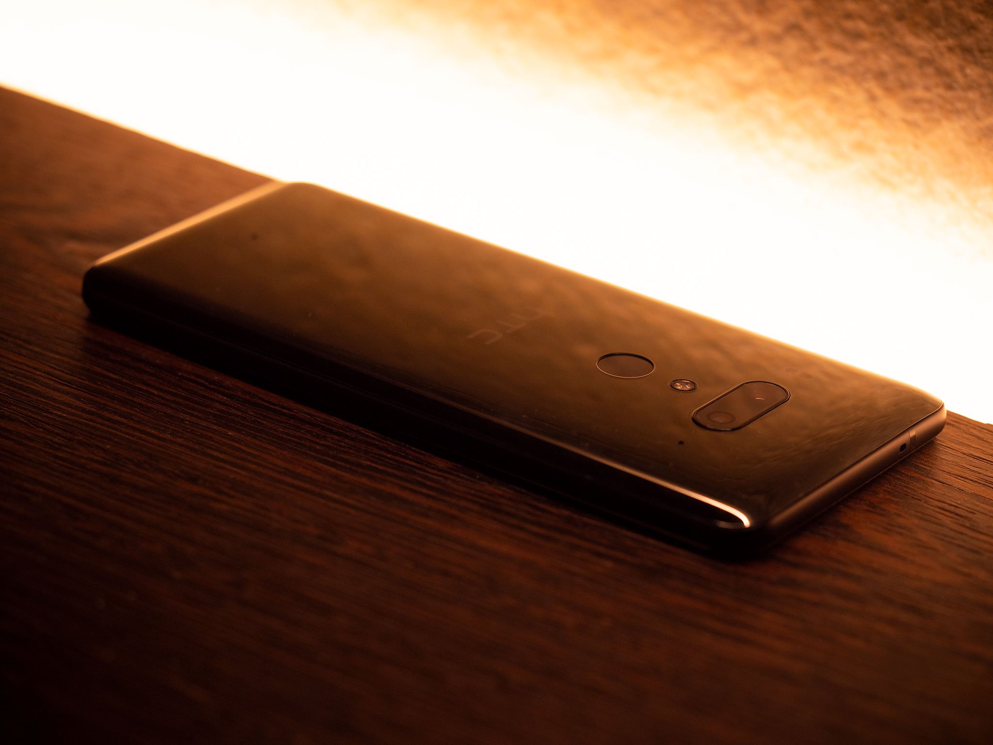
Like HTC's past two flagships, the rear of the U12+ is far more visually appealing. I've been using the standard reflective gunmetal color, which is almost identical to the same hue in last year's U11+. There's also a translucent blue option, which gives you a peek at the innards of the phone, as well as a fiery iridescent red, which shifts between blood red and a golden yellow.
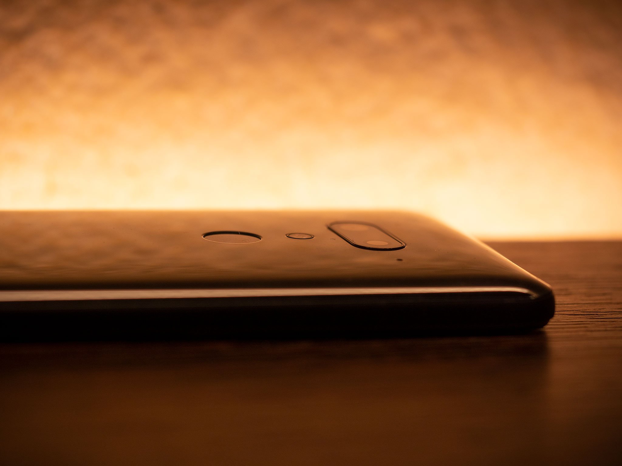
The U12+ is a little on the chunky side, but HTC's lustrous glass designs shine through.
| Category | Specification |
|---|---|
| Operating System | Android 8.0, HTC Sense |
| Platform | Qualcomm Snapdragon 845 Adreno 630 GPU |
| Display | 6-inch 2880x1440, Super LCD 6 DCI-P3, HDR10 Gorilla Glass 5 |
| RAM | 6GB |
| Storage | 64 / 128GB UFS 2.1 |
| Main Camera | 12MP, 1.4μm pixels ƒ/1.75 lens, OIS, EIS UltraPixel 4, UltraSpeed AF, HDR Boost |
| Secondary Camera | 16MP 1μm pixels ƒ2.6 lens, 2x optical zoom, portrait mode |
| Video | 4K @ 60fps 1080p @ 240fps slo-mo 360° 3D Audio with 4 microphones |
| Front Cameras | Dual 8MP sensors 1.12μm pixel size, f/2.0 84° wide-angle FOV, portrait mode |
| Water/Dust Resistance | IP68 |
| Battery | 3500 mAh Qualcomm QuickCharge 4.0 |
| Audio | HTC BoomSound Hi-Fi edition HTC USonic USB-C + noise cancelling headphones |
| Network | 4G LTE Cat. 18 up to 1.2Gbps FDD Bands 1,2,3,4,5,7,8,12,13,17,20, 28, 32, 66 TDD: Bands 38, 39, 40, 41 |
| Voice assistants | Google Assistant, Alexa |
| Colors | Translucent Blue, Flaming Red, Ceramic Black |
| Dimensions | 156.6 x 73.9 x 8.7-9.7mm |
| Weight | 188 g |
The back panel has an oleophobic coating, which makes it less fingerprint-prone than the Galaxy S9 and LG G7, but a bit more slippery.
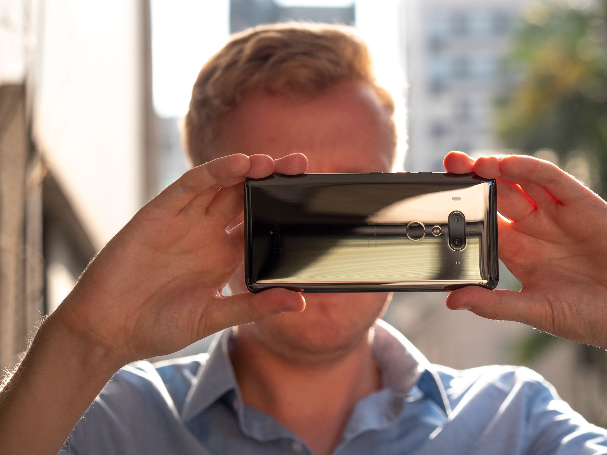
The overall feel is more chunky than similar-sized phones like the OnePlus 6, or even Samsung's S9+, but the basic ergonomics of this design are sound. It's comfortable to hold, and thanks to the addition of a decent one-handed mode in HTC's Sense software, it's easier to wrangle than the U11+ without bringing in a second hand.
Despite the ample heft of this phone, there's unfortunately no headphone jack included, nor is there any USB-C-to-3.5mm dongle in the box this time. (HTC includes it as a pre-order bonus in some markets.)
There's nothing too surprising about the spec sheet of the U12+, which combines a Snapdragon 845 processor with 6GB of RAM, and 64/128GB of storage depending on where you buy it, and dual-SIM functionality in some markets. (I've been using a single-SIM version of the phone.)
HTC, once again, sticks with LCD technology for the display, going against the grain of the smartphone industry. And though the U12+'s 6-inch panel doesn't boast the same brightness as leading OLED panels from Samsung, it's still an attractive panel with no visible ghosting, and pleasing, punchy colors.
The main thing you miss out on compared to competitors like the Galaxy S9+ and Huawei P20 Pro is daylight visibility, and the ability to use the Always-On Display mode without tanking your battery. (The U12+ includes such a mode, but it's wise to only enable it when picking up the phone.)
HTC's spec sheet matches the cutting edge in all but a couple of areas.
Battery life was weak and unpredictable on the original U12+ firmware, but it's settled down considerably on the new update, to the point where it's landed in that sweet spot for an easy "full day" of use. Day-to-day, I'm getting around 16 hours between charges, with four-to-five hours of screen-on time. That's nothing mind-blowing, but certainly acceptable. It about matches what I get out of the OnePlus 6, with a little bit of a harder hit when the screen is running in daylight at max brightness.
Criticism aside, the U12's longevity is not a whole lot worse than what I've been getting from the Exynos version of Samsung's Galaxy S9+. Plus, unlike that phone, you get Quick Charge 4 support, assuming you have your own compatible plug.
At least HTC's audio credentials remain strong, outside of that sadly absent headphone jack. The U12+ boasts a meaty BoomSound Hi-Fi system, combining the single bottom-facing speaker with an earpiece tweeter, for satisfyingly loud and bassy audio reproduction.
HTC's USonic active noise-cancelling earbuds, bundled with the phone, are great too. They haven't changed since they first appeared alongside the U11, but they're about the best bundled earbuds I've used with a phone. HTC's Sense software can instantly and automatically tune its audio output to the structure of your ear canals, with results as impressive as we've witnessed from older HTC phones.
The pressure-sensitive buttons
In our original review, we weren't kind to the U12+'s digital buttons, because, in short, they were bad from start to finish. The digital non-button buttons were unreliable, with sensitivity levels jumping about all over the place, and prone to ghost input that in extreme cases would cause the phone to hard reset itself. This was the main reason to not buy this phone. A fundamental hardware feature was broken out of the box.
The buttons are so weird because they're not truly buttons in the traditional sense. They're pressure-sensitive nubs that give haptic feedback when pressed, a bit like an iPhone's home button. The haptics aren't anywhere near as good as the iPhone's -- but they're also not terrible, once you get used to the feedback coming from the middle of the phone and not the area you're pressing.
The buttons are a continuation of the Edge Sense feature from last year's HTC U11. And that feature has some new tricks too. Now you can double-tap on the sides to bring down the notification shade, or use one-handed mode. Edge Sense can now keep the display from sleeping while the device is in your hand, and switch between landscape and portrait mode more intelligently. By understanding how you're holding the phone, it can stay in the correct orientation even if you're laying sideways in bed.
It's been great to be able to finally use these features with the new U12+ software update, because on the old software they were frustrating and unpredictable.
So the tl;dr here is that the update has basically fixed the buttons. Very occasionally I still notice fluctuations in sensitivity when the temperature changes -- it's 99% reliable, not 100%, but it's to the level now where I'm fine with it. That said, I still prefer real buttons. And I feel like the saga of the past couple months with these buttons could have already sunk this phone.
If the U12+ had shipped with this newer firmware, HTC surely could have saved itself a lot of bad publicity.
If you've already used an HTC U11 or U11+ on Android Oreo, or read our review of the U11+ from last November, then you'll have already seen almost everything The U12+ has to offer on the software side.
We're still running Android 8.0 here, not the newer version 8.1. (The main impact for many of us: no Netflix support for picture-in-picture mode.) Otherwise, The user-facing side of Android 8.1 is largely identical to 8.0.
Sense remains locked in the same holding pattern it's been stuck in for much of the past couple years.
Otherwise, it's another year with virtually no changes in either the way HTC Sense looks or functions. On one level, that's fine. Sense is so close to stock Android now that there's not much need for surface-level changes.
On the other hand, Sense is still littered with the dregs of older software versions. As we've noted in earlier reviews, many core apps like Weather, Contacts, Messages and the Dialer haven't changed in more than three years. In Sense Home, more subtle clues of HTC's lack of design effort can be seen: The rows of home screen icons are aligned for a 16:9 display, not the U12+'s 18:9 panel.
The biggest changes are, in fact, two very welcome additions: The one-handed mode, which is necessary on a phone this large. It's activated with a double-tap on the bezel (see above — this does not work well!), or a triple-tap on the home key. And the U12's dual front cameras help to enable face unlock, which is among the fastest on any Android phone I've used. HTC's software can also light up the display for better face detection in darker conditions
Beyond those few upgrades, this is a fast, relatively clean Android UI that's in dire need of a facelift. As I said six months ago, HTC needs to either go all-in on a near-stock Android experience like OnePlus's OxygenOS, or truly differentiate its software with a new completely new look that doesn't look like it belongs in 2014.
For all its troubles, HTC continues to excel at smartphone photography.
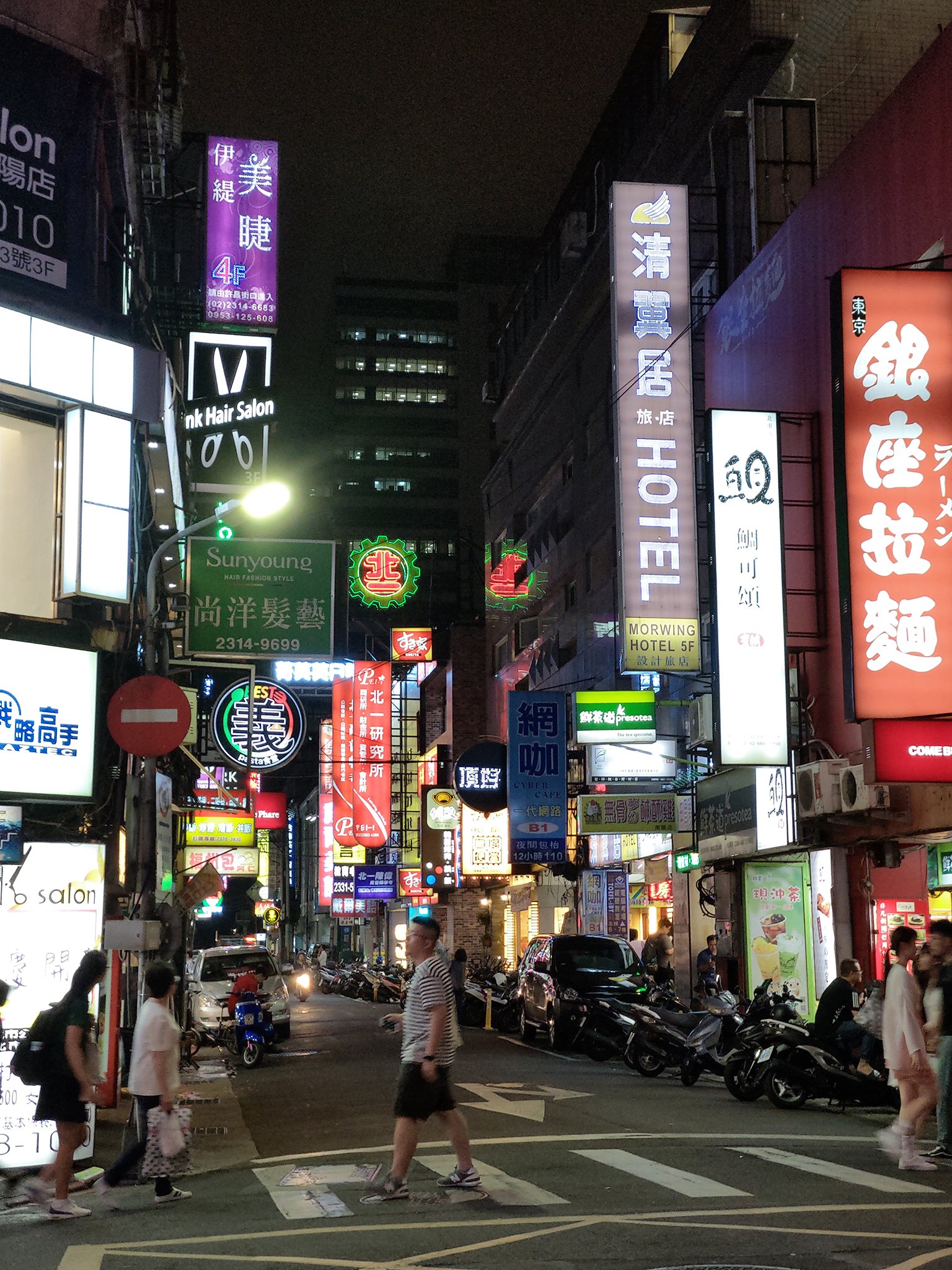
The U12+'s saving grace is its camera setup, an area where HTC is truly competitive with the best phone cameras of the moment. This dual-camera array around the back can absolutely go toe-to-toe with the Galaxy S9+ and Huawei P20 Pro, and in some cases come out on top.
HTC combines a 12-megapixel main sensor with f/1.75 lens and optical stabilization with an f/2.6, 16-megapixel telephoto camera. The telephoto has smaller pixels on the sensor and no OIS — an on-paper disadvantage compared to Samsung's zoom camera.
But HTC's secret sauce is its HDR Boost function. First seen on the U11, the second-generation of HTC's post-processing feature allows it to bring out awesome fine detail and high dynamic range, even in challenging situations. As I've said before, HDR Boost is a competitive recreation of the post-processing setup Google uses in HDR+ on its Pixel phones, though I've noticed that in darker conditions HTC's will favor grainier output in order to produce a brighter-looking shot. Whether that's good or bad is a matter of personal preference. Some may prefer the softer but less noisy output of Samsung's Galaxy S9+.
It's also worth noting an additional caveat: Despite its dizzying DxOMark score of 103, the U12+ can't match the insane low-light detail provided by the Huawei P20 Pro's industry-leading low-light mode.
HTC takes another crack at software bokeh, and the results range from competent to truly impressive.
HDR Boost also allows the U12+ telephoto camera to eke out better-looking telephoto shots than it has any right to given the optics of its secondary camera. In many darker situations, the HTC camera would stick with a shot from the secondary camera, as opposed to a digital crop of the main sensor.
HTC has also built out its own software bokeh mode, which doubles as portrait mode on the U12+, adding artificial lens blur to shots. On the whole, it's technically proficient, and I've captured some impressive shots of people, food and pets using HTC's bokeh mode. The end results are on par with what I've seen from the Google Pixel 2 and Huawei P20 series, and it's also possible to edit the level of blur after the fact in Google Photos — though this option is somewhat hidden.
Meanwhile, around the front, HTC packs a twin 8-megapixel camera setup, allowing accurate bokeh shots through the front camera without the software guesswork of some rivals. As with the main camera, selfies from the U12+ are grainier than competitors like the Galaxy S9, particularly in darker conditions, but they often retain more fine detail pics from the Samsung device. There's a full array of beauty modes too, for smoothing skin and digitally re-jigging your features.
For what it's worth, HTC also has Animoji-style stickers in its camera app, the existence of which I'll note here for the record. They're there. I guess they'll be fun if that's your thing. Like Samsung's AR Emoji, I've mostly ignored them in my time with the phone.
My only real complaint around the U12+'s camera has to do with its speed. The app is frequently slower to load than most rivals, and processing times for HDR Boost are a little on the long side. The trade-offs, with patience, are worth it, but on a couple of occasions, I've missed shots due to the camera taking too long to fire up.
HTC's new flagship also has a competent video camera, building on features like 3D Audio and Acoustic Focus — amplifying volume from specific areas as you zoom — that debuted in the U11. Advances in optics and processing bring predictable improvements in video quality for HTC, however, it's a little disappointing to see electronic stabilization limited to 1080p resolution. Some rivals, including the cheaper OnePlus 6, can manage stabilized video at 4K resolution.
HTC U12+ Bottom Line
The new firmware basically transforms the U12+ from a bad phone into a good phone. There are the usual quirks that you get with every handset, but nothing deal-breakingly bad. The fundamentals are solid, performance is fast, and the cameras truly impressive.
But what's also worth considering is HTC's pretty dire track record for customer support. Tales of phones going missing for months at a time in the bowels of the company's repair system are common, and if you're blowing $799 on a handset, you need to know you're not going to be left in the lurch if something goes wrong.
Same deal with software support. When a company hits on hard times, firmware updates are often first on the chopping block. Don't hold your breath for timely security patches going forwards, nor any timely platform upgrades beyond Android P.
There's also the question of HTC's future in general, and how long the inertia that's sustaining the company can last. Whether or not there'll even be a successor to the U12+ next year is an open question -- Blockchain phones notwithstanding.
At least if this is the beginning of the end for the original Android brand, it's mostly going out on a high with a device that fans will love.
#Google #Android #Smartphones #OS #News @ndrdnws #ndrdnws #AndroidNews

